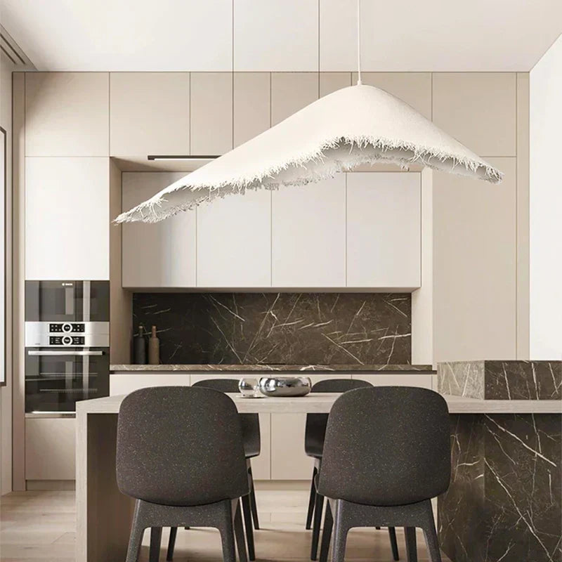
Gold-coloured lighting and silver-coloured furniture are options to compare in the same room; matching everything is another option. Start with the pieces you intend to keep, then compare the new finish in that setting. A colour name or a fixed proportion of metals cannot tell you which combination you will prefer.
Start with what will stay
List the larger or less easily changed pieces: chair legs, a lamp, door handles, a cabinet and anything you particularly like. Look at them from the doorway and from your normal seat. A small handle at the far end of a room may not matter as much to you as a lamp next to your face.
Include the surrounding wood, paint and fabric in the comparison. The choice is not just gold against silver on an isolated sample card. You are deciding whether a particular new object belongs among the things you live with.
Compare the surface, not just its name
For each candidate, ask for the exact finish name and code, its surface treatment and the material underneath. If a listing uses “gold”, “brass”, “chrome” or “silver”, ask whether the word identifies colour, a coating or a material. Do not choose a care routine from that word alone.
Keep colour and sheen separate in your notes. Ask whether the actual surface is polished, brushed, satin, textured or deliberately aged, and request a close view of the chosen version. If you cannot obtain a sample or reliable detail, leave that part of the comparison unresolved rather than treating two similar photographs as a finish match.
Try matching, then try a clear contrast
Begin with a small change you can test. A movable object or an available finish sample is more useful for this first comparison than ordering a large permanent fitting. Check that the sample is actually offered and represents the version you plan to buy; do not assume every seller supplies one.
Try a candidate that is close to an existing finish, then one with a more obvious difference. Ask which relationship you prefer when you look at the whole room. Repeating a finish on another small object is an optional styling test, not a reason to replace every handle or buy extra accessories.
If the room already has many attention-grabbing surfaces, try simplifying the objects around the new piece before making a purchase. A fixed percentage rule does not decide whether a finish is too noticeable from your particular seat.

Use your normal daylight and evening view
Put the actual samples or objects beside the things that will stay. Look from the same places in ordinary daylight, then under the lights you use at night. Record whether you like the colour relationship, the visible highlights and the amount of attention the new object attracts.
Photographs can help you remember the arrangement. They are not calibrated colour evidence. Keep the object identity and viewing conditions in the notes so that a different camera exposure or screen does not quietly become the reason for your decision.
Keep a finish record for the exact item
| Record | What to compare |
|---|---|
| Item you will keep | Its location and the visible surface |
| New candidate | Exact finish name, code and chosen version |
| Material and treatment | Seller-confirmed details, not a colour guess |
| Colour and sheen | Observed separately from your usual places |
| Daylight and evening | Actual objects, viewing conditions and preference |
| Unresolved point | Missing sample, detail photograph or care information |
A useful finish record can also make a seller question more precise: “I want this lamp next to this chair. Is the selected finish brushed or polished, and can you provide a close view of that exact option?”
Let the item’s job come first
Before keeping a colour combination, check that the new item works where you intend to use it. For a lamp, confirm size, power connection, installation and the information needed for its intended light. For a chair or table, check actual dimensions, usable space and care. An attractive finish does not resolve an unsuitable position.
Do not carry a finish idea from a bathroom photograph into a wet-location lamp choice. Installation and location suitability need the exact product’s information. This guide is a dry-room finish comparison, not a lighting specification.
Choose what you can live with
Keep the candidate when its finish relationship, practical use and remaining uncertainties are acceptable to you. Choosing a quieter match is as legitimate as choosing contrast. You do not need to make the entire room new to make one addition feel considered.
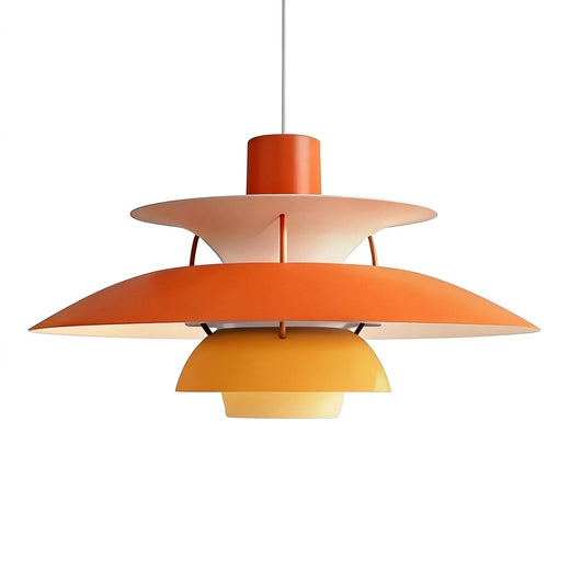
If you are also choosing a pendant’s body colour, compare it with the actual dining table and room. Ask for missing details of the exact option, then browse lighting with those requirements in mind.